AI for Supply Chain & Profit Optimization

🎯
🧋
Overview
Role: Sole Product Designer
Timeline: 3 Weeks
Context: 0-to-1 MVP for Fintech/Logistics Client
Core Metric: Reduced "Time-to-Viability" assessment from ~14 days to <2 minutes.
Executive Summary
Sourcing a product typically requires navigating 15+ disjointed logistics decisions. One wrong choice between shipping terms can destroy a profit margin before the product even launches.
The Outcome
Designed an algorithmic dashboard that replaces a heavy manual spreadsheet process with a linear decision flow. This reduced the critical time-to-viability assessment from ~14 days to <2 minutes, allowing founders to validate ideas instantly.
The Business Thesis -
Friction is Mental, Not Financial
The client’s business model depends on new entrepreneurs successfully launching products. However, data showed users dropping off during the research phase due to premature conclusions or data overwhelm.
The User Insight
During interviews, I saw founders opening 15–25 different browser tabs to model a single product. They were paralyzed by the effort of correlating freight, duty, and storage costs.
The Strategy
We needed to move the user from passive "Data Entry" to active "Strategic Simulation."
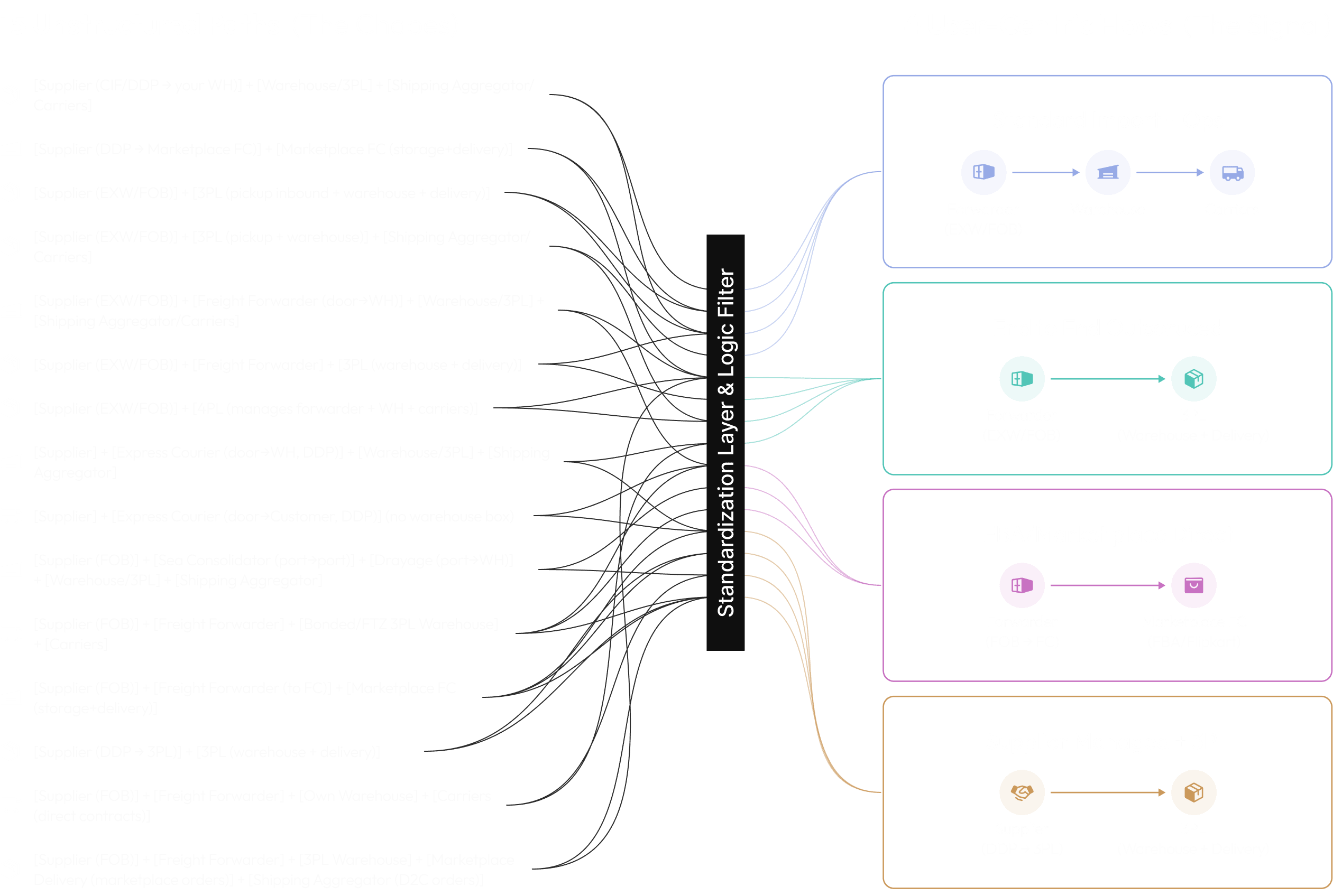
Architecture: Simplifying the Choices
The initial scope suggested supporting every possible logistics path. This was a trap. Infinite choice creates infinite hesitation and will also make the design highly unscalable and complex.
The Pivot: 15 Paths → 4 User-Centric Flows I filtered the logistics network down to the four paths that actually matter to our SMB users (e.g., Forwarder → 3PL).
Design Impact:
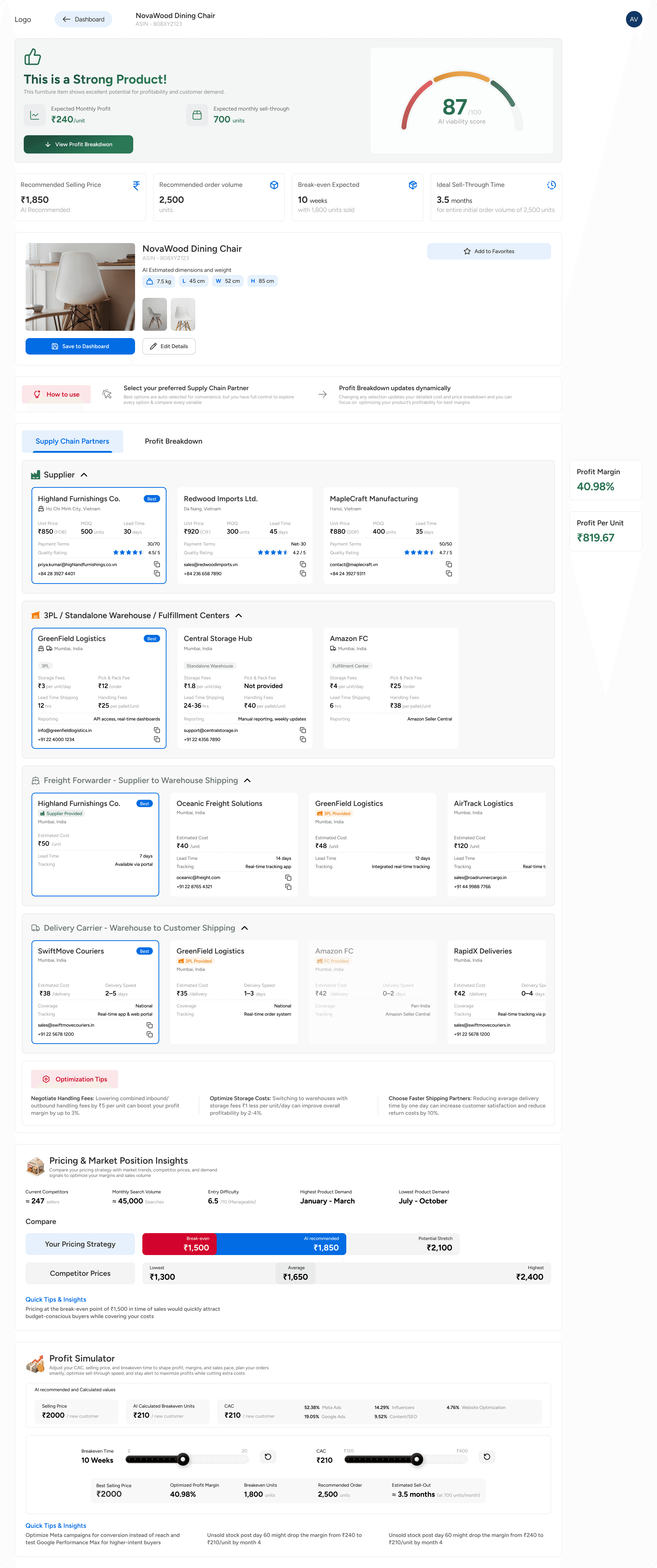
IA Transformation: This reduction allowed me to switch from a complex "Tree-Picker" menu to a Linear Stepper. Users are now guided through a strict sequence, reducing cognitive load by exposing only relevant decisions.
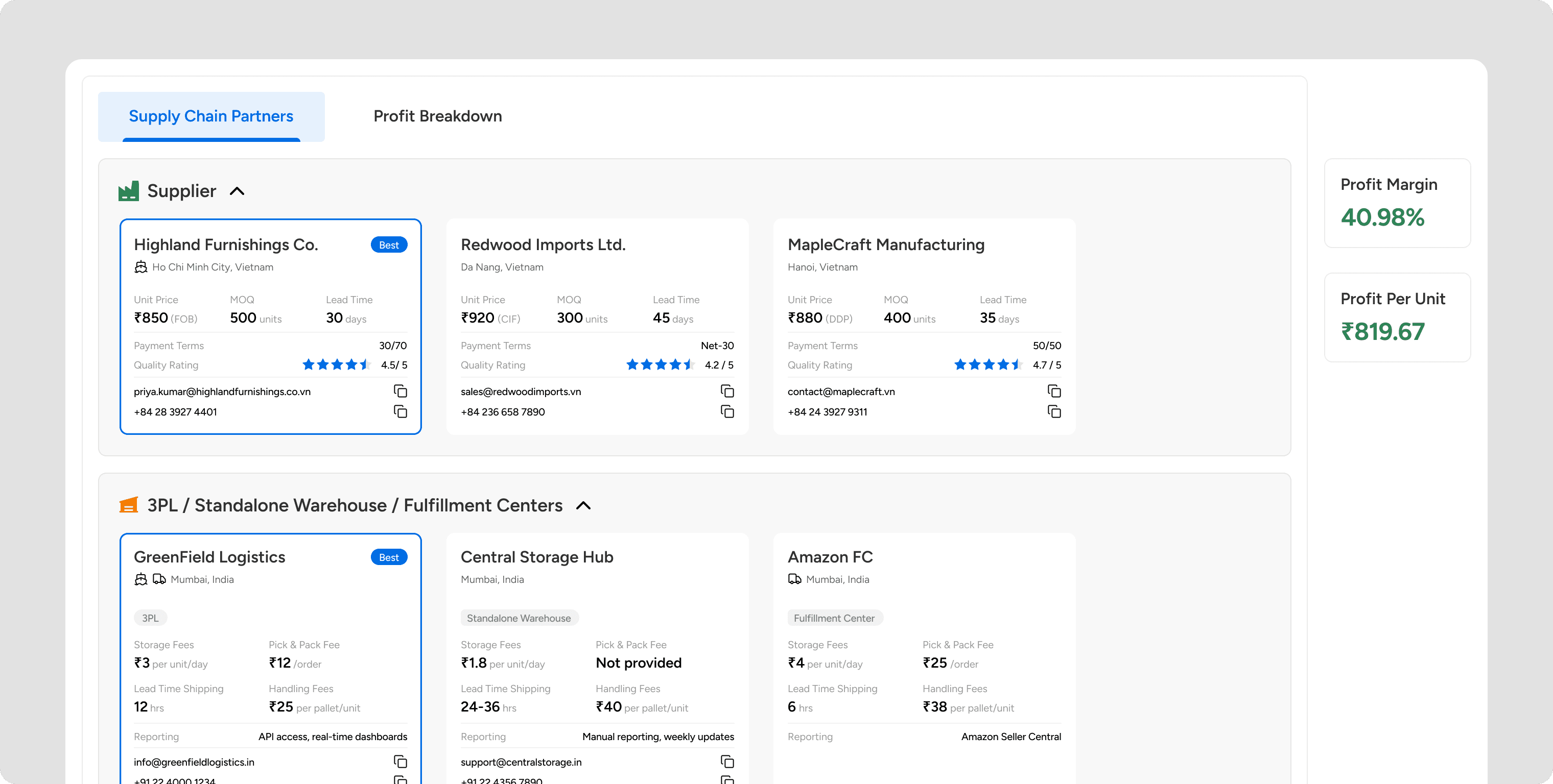
Layout Strategy: I rejected the client’s request for a "Long Scroll" dashboard, which often buries key data. Instead, I implemented a Tabs that separates "Partner Selection" (Building) from "Profit Analysis" (Reviewing). This ensures users can tweak logistics without losing financial context.
Interaction Design
The "Persistent Profit" Anchor
The most critical UI element I designed was the Persistent Profit Anchor.
The Conflict: In standard dashboards, when you click away to check a shipping price, you lose sight of your total cost. You forget your target margin.
The Solution: I pinned the "Profit Breakdown" to the side of the screen. It sticks to frame.
The Outcome: It responds instantly to every selection change. As users toggle, the Net Profit % updates in real-time. This allows users to tweak their choices and immediately see the impact without switching tabs.
Refining the Logic: Heuristics & Guardrails
Beyond the macro layout, I implemented specific UI mechanics to handle the complexity of supply chain relationships and prevent errors:
Handling Edge Cases (Scenario Modeling): Narrowing 15 paths to 4 created a risk: What if a user wants to use their own private garage instead of a warehouse?
The Solution - I implemented a 'Dynamic Exclusion' toggle in the cost breakdown.
The Outcome - Users can 'Hide' specific costs they plan to manage themselves. This keeps the UI simple for the 90% majority while remaining flexible for the 10% of DIY entrepreneurs.
Error Prevention (Conditional States): To prevent invalid configurations, I used disabled states. For example, "Amazon Delivery" remains locked unless "Amazon FC" is selected in the Warehouse step. This acts as a guardrail, ensuring users build a realistically viable supply chain.
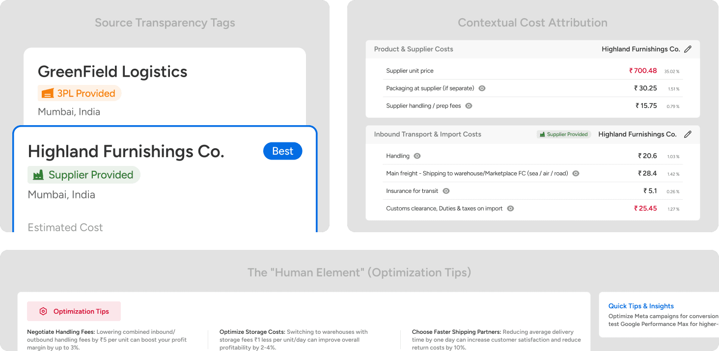
Source Transparency Tags: I added subtle badges (e.g., "Supplier Provided" vs. "3PL Provided") on every cost card. This clarifies ownership instantly—users know exactly who handles the freight without needing to guess.
Contextual Cost Attribution: In the final breakdown, I explicitly restated the Selected Partner’s Name next to their specific fee. This reduces memory load—users don't have to mentally track "Who is charging me for this fee?" while analyzing the final numbers.
The "Human Element": Realizing that AI can calculate costs but not negotiate deals, I added an "Optimization Tips" card. This prompts users to take offline action (e.g., "Ask for volume discounts"), bridging the gap between digital data and real-world business.
Technical Constraints: Designing for Trust
The system uses a live tool to find real-world shipping rates. This takes about 15–20 seconds.
The "Trust" Pattern
To a user, a generic spinning wheel looks like the app is broken. To fix this, I designed a Narrative Loader.
Instead of a generic animation, the screen tells the user exactly what is happening:
"Reviewing your product’s details and matching with top suppliers..."
"Locating the best warehouse closest to where you want to sell..."
"Estimating product size and weight for logistics planning..."
Why this minute thing matters - In a financial tool, silence is scary. This builds trust by showing that the system is working hard, not working slow.
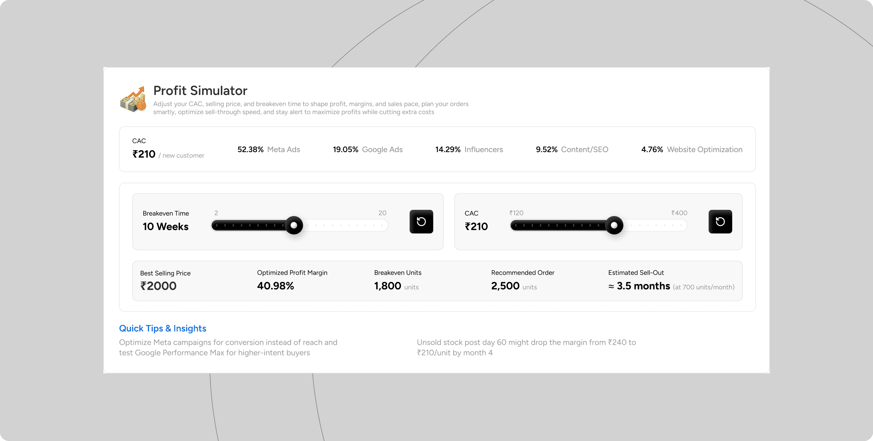
Business Logic: The Simulator
New entrepreneurs are often scared of Customer Acquisition Cost (CAC)—the money spent on ads. They view it as a loss.
I wanted to change that mindset. I designed a Profit Simulator with dynamic sliders.
Interaction: User increases "Marketing Spend."
Feedback: The "Time to Breakeven" graph updates instantly.
The Insight: The slider allows founders to see that spending more on marketing can actually shorten the time it takes to become profitable by driving more sales. It turns anxiety into a plan.
Validation
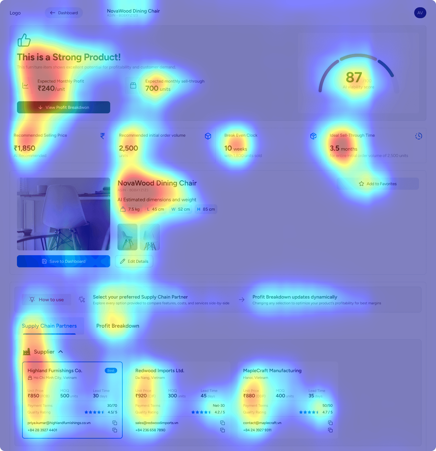
To validate the hierarchy, I generated Attention Heatmaps to test if the layout matched the entrepreneur's psychological needs.
The Hypothesis: Entrepreneurs are "hunters" first. I predicted their immediate anxiety would drive them to find the "Verdict" before diving into the "Details"
The Evidence: The heatmap confirmed this behavior. The most intense "Red Zones" were on the Viability and Profit Summary at the very top
The Success: The heat diffuses sequentially downwards: Verdict > Partners > Optimization. This confirms the design successfully guides users from "Panic" (Can I afford this?) to "Action" (How do I optimize?), preventing cognitive overload.
Final Design
Retrospective & V2 Vision
While the current version makes data collection easy, the "Viability Score" is just a number. If a product scores "Low," the user hits a dead end.
The V2 Strategy: The product needs to evolve from a Calculator to an Advisor. Future versions should suggest specific fixes—for example, "Switching to Sea Freight will increase your margin by 12%"—so the user always has a next step and isn't left to ponder on his own.

